Microsoft Word has so many features. These features don’t always result in the kind of beautiful, high-quality, and professional document designs that you may expect. It’s one thing to know everything about Microsoft Word, all of its intricacies and quirks and functions. It’s something else entirely to know what makes a great document. Here, we’ll show you Hacks To Format A Word Document Professionally.
1. Keep it simple; more is less.
Do you want to learn how to make a Word document look professional? Simply keep things simple and take advantage of Microsoft Word’s hidden capabilities. Let this be the one thing you remember from this essay, and you’ll be able to make better design decisions in the future! This is the first Hacks To Format A Word Document Professionally.
When drafting a document, the major focus should be on the content. The purpose of document formatting principles is to make text easy to read and understand. Avoid the urge to add distracting components to your design. Make use of as much whitespace as possible. Keep your sentences and paragraphs short and sweet, and edit any that are too long. Overall, the regulations are simple.
2. Select a Typeface That Is Appropriate for the Situation
Serif fonts vs. sans-serif fonts
The typeface you’ll pick should be your first major design decision. Serif fonts are easier to read in printed materials, whereas sans-serif fonts are easier on the eyes when read on a computer screen, according to conventional wisdom.
Garamond, Georgia, Hoefler Text, and Palatino are examples of serif typefaces, while Arial, Gill Sans, Helvetica, and Lucida Sans are examples of sans-serif fonts.
If you want to avoid one of the most prevalent presentation design mistakes, also avoid Comic Sans. And whatever typeface you choose, make sure to use it throughout the document. You can select a different typeface for headings if you want.
3. Use Times New Roman in standard font size and color.
You won’t be able to learn how to style a word document to look professional unless you pay attention to the text’s appearance. When combined with the rules for page size, margins, and line spacing outlined below, business and academic documents commonly employ 12-point font sizes, which generate the best readable paragraphs. This is the third Hacks To Format A Word Document Professionally.
It’s better to stay away from everything that has to do with colors in general, particularly when it comes to printed materials. Use bolded and italic text to accentuate key points.
4. Make use of standard margins and page sizes.
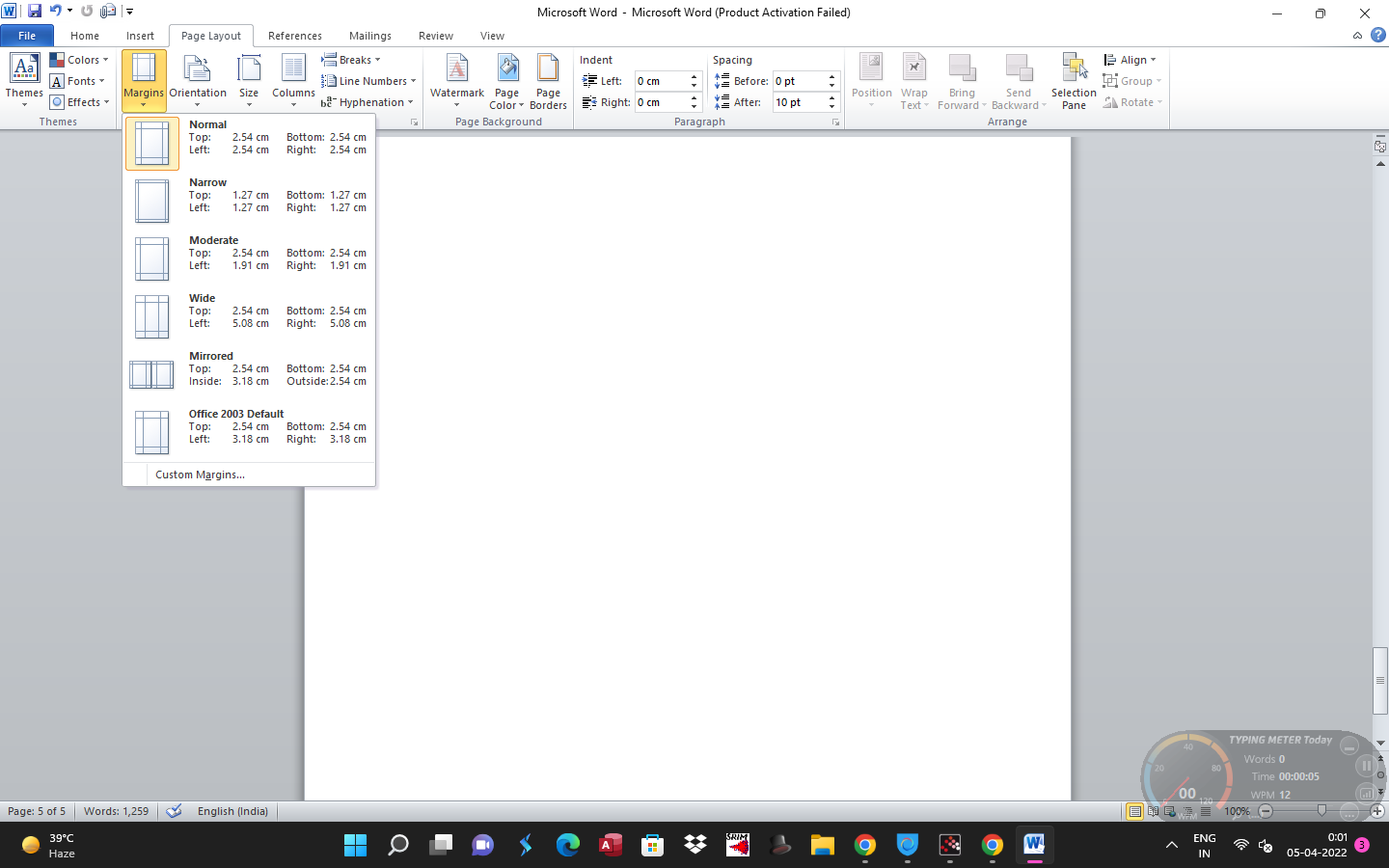
Formatting options for Microsoft Word margins
US Letter size, which is 812″ x 11″ pages is the only size that will always be available, no matter what printer you use.
Also Read: 10 Instagram Marketing Tools
The optimum readability for line lengths is also achieved with a margin on all sides of the page, which allows for written annotations if needed. If the page will be bound in a binder, you may want to expand the side margins to 112 percent “to allow the rings to fit.
5. Align paragraphs to the left
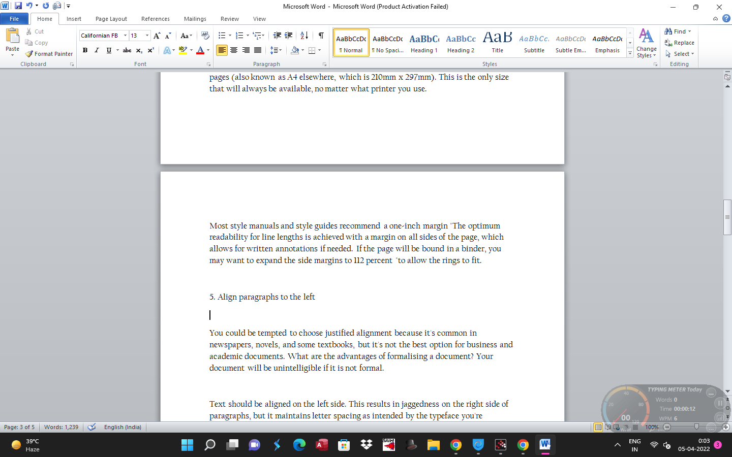
Your document will be unintelligible if it is also not formal. The text should be aligned on the left side. This results in jaggedness on the right side of paragraphs, but it also maintains letter spacing as intended by the typeface you’re choosing, ensuring maximum legibility. Otherwise, you also risk creating typographic rivers that are both obtrusive and unattractive.
6. The First Lines of Paragraphs Should Be Indented
Paragraphs with word indent
There should be no unnecessary spacing between paragraphs, and the first line of each paragraph should be indented to make it stand out. The sole exception is paragraphs immediately following a section title, which can be left unindented because the context indicates that it is its paragraph.
The indent size should be the same as the font size as a general rule of thumb. To handle the indents, make sure you use Word’s paragraph styling features rather than the Tab key!
7. Images should be placed between paragraphs.
It’s possible that placing photos inside a paragraph and allowing the surrounding text to flow around it is OK, and if your company prefers it that way, go ahead and do so. However, it can wreak havoc on readability, particularly in data-driven reports.
Putting photos in between paragraphs and keeping them center aligned is the safest approach, especially for graphs, charts, and tables. Your photos will never compete for attention with the surrounding text this way. It also makes captions more noticeable.
8. Select Line Spacing That Is Appropriate for the Situation
Paragraph Line Spacing in Microsoft Word
Line spacing (the whitespace that separates one line of text from the next line of text) should be determined by the type of document you’re composing.
If there are no academic style rules in place, academic writings should use double-spacing. Single-spaced business and office documents are common to reduce the number of pages needed for printing, however, digital documents may be simpler to read if spaced at 120-150 percent.
9. Use headings and lists to break up long passages of text.
Microsoft Word Heading
The more significant headings become as the document gets longer. Would you want to read a 20-page report that is a wall of text from beginning to end? Or a 30-page report divided into sections.
Lists are also useful for breaking up long walls of text and directing attention to key areas. When counting a group of items (e.g., “the five traits of a successful entrepreneur”) or offering step-by-step instructions, use numbered lists. Aside from that, bulleted lists are fine. Just be careful not to overuse lists, as this will distract from the readability of your Word document design.
This is very critical when formatting a screenplay in Word.
10. Use Breaks to Separate Sections
Setup of word breaks
You should study section breaks if you want to learn how to make your report look professional. Section breaks in Microsoft Word allow you to distinguish distinct pages by changing the orientation, columns, headers, footers, page numbers, and more. Breaks between sections are inevitable.
- Next Page: Start the next section on the following page.
- Continuous: Start the next section on the current page.
- Even Page: Start the next section on the next even page.
- Odd Page: Start the next section on the next even page.
If your document is large enough to need chapters, this is the best way to format them cleanly. Each chapter should be made with a “Next Page” section break or the “Even Page” or “Odd Page” section breaks if you’re going to place it within a binder. We’ve shown how to remove page breaks if needed, too.